Một liên lạc của độ sáng trong chủ nghĩa đơn sắc.
Trang web đen và trắng đang ngày càng trở nên phổ biến như là một tiêu chuẩn màu thiết kế. Tuy nhiên, thực hiện một thiết kế đen trắng bắt mắt là nghệ thuật đòi hỏi kỹ năng tuyệt vời và tầm nhìn nghệ thuật nổi bật. Các typogrpahy và bố cục phải thực sự đáng chú ý để trang web không bị nhàm chán. Nhưng một màu khác có thể mang lại sức sống và tính cách cho bất kỳ thiết kế đen trắng nào. Hãy thử tưởng tượng 33 trang web dưới đây là đơn sắc. Họ sẽ có hiệu quả?
RGA
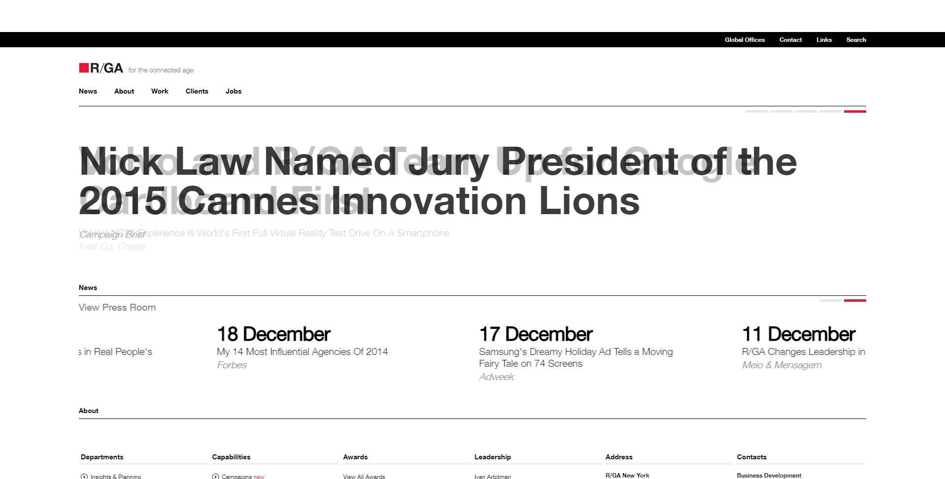
Một trang web đen trắng cổ điển amlost ngoại trừ một vài yếu tố màu đỏ nhỏ, chẳng hạn như các mục menu và liên kết, chuyển sang màu đỏ khi di chuột.
JonahL
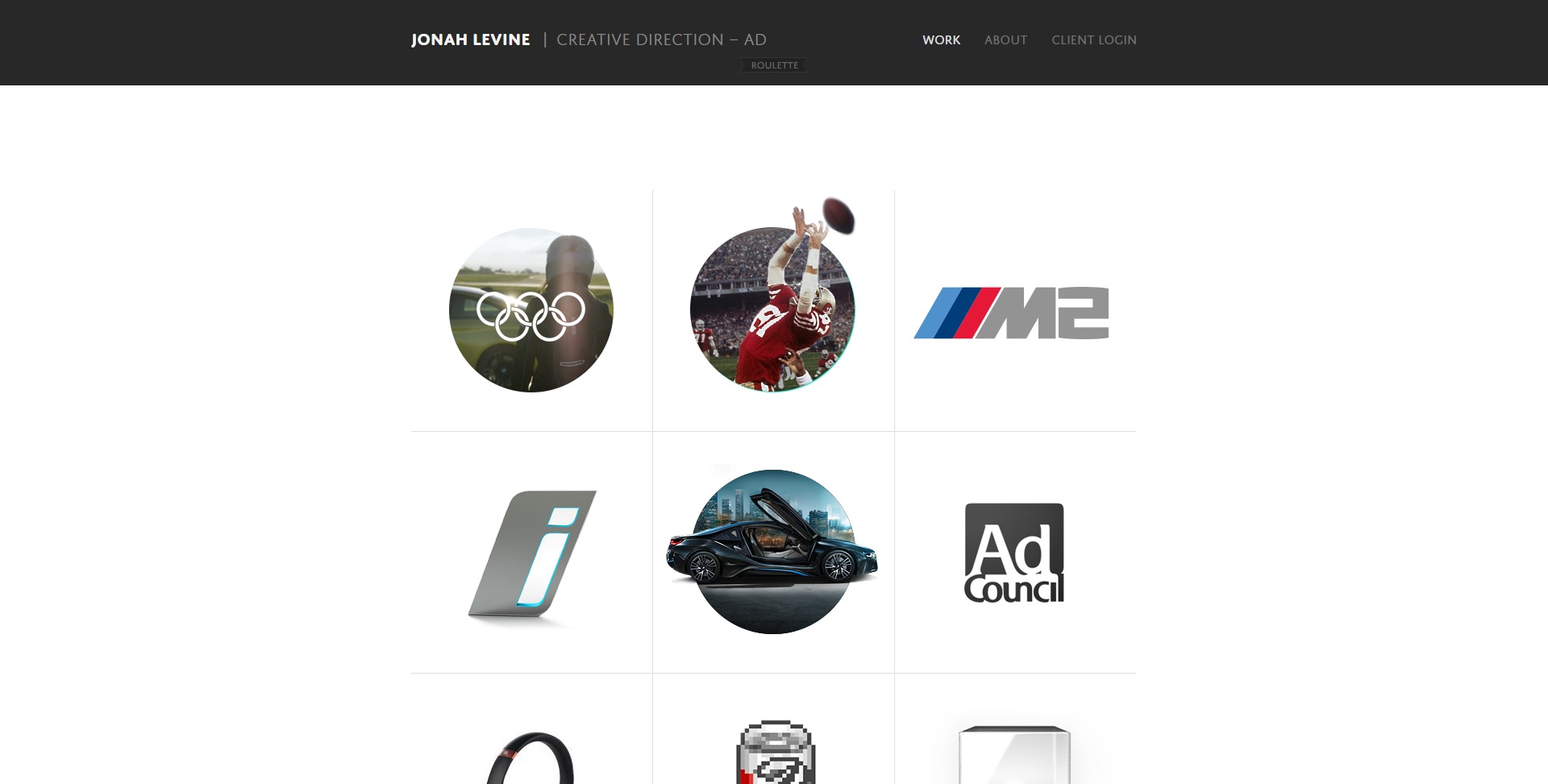
Mục menu đã chọn có màu đỏ trong danh mục này.
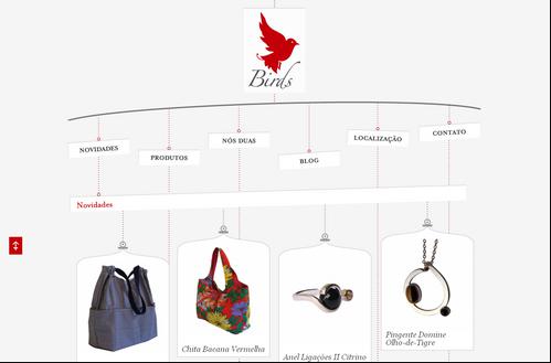
Loja Birds
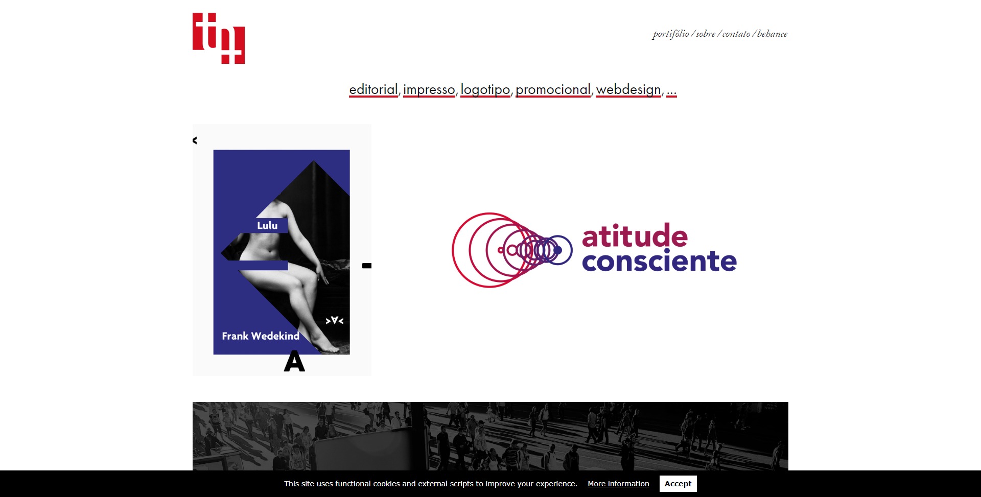
1MD
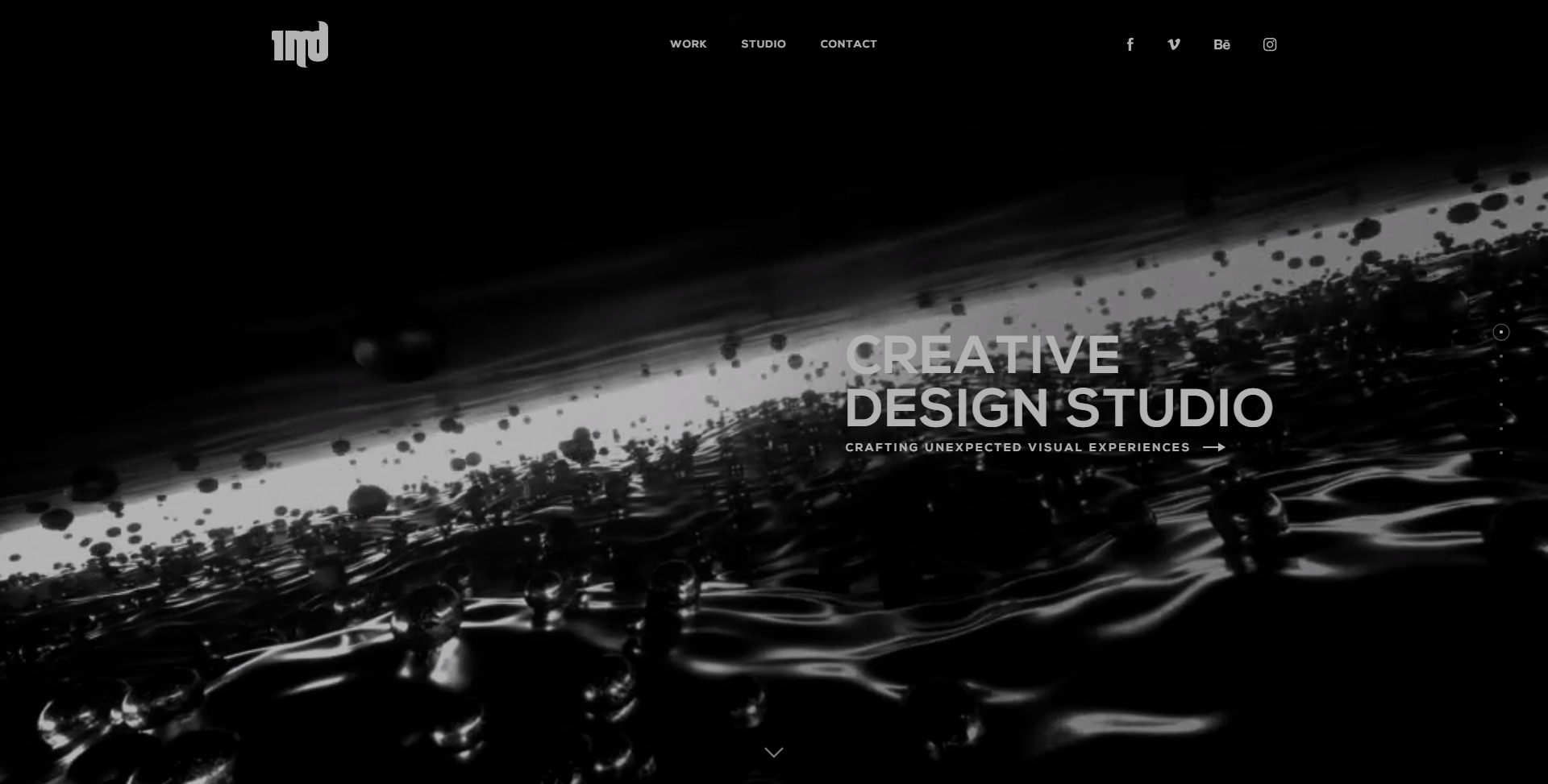
Mục menu đã chọn được tô đậm bằng màu đỏ. Thêm vào đó là một vài yếu tố màu đỏ tươi trên mỗi trang.
James Chambers
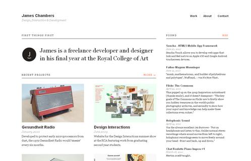
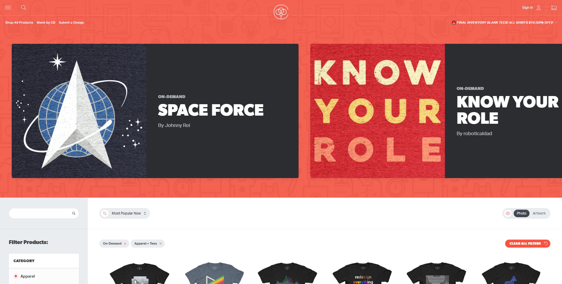
Các mục menu và liên kết chuyển sang màu cam khi di chuột.
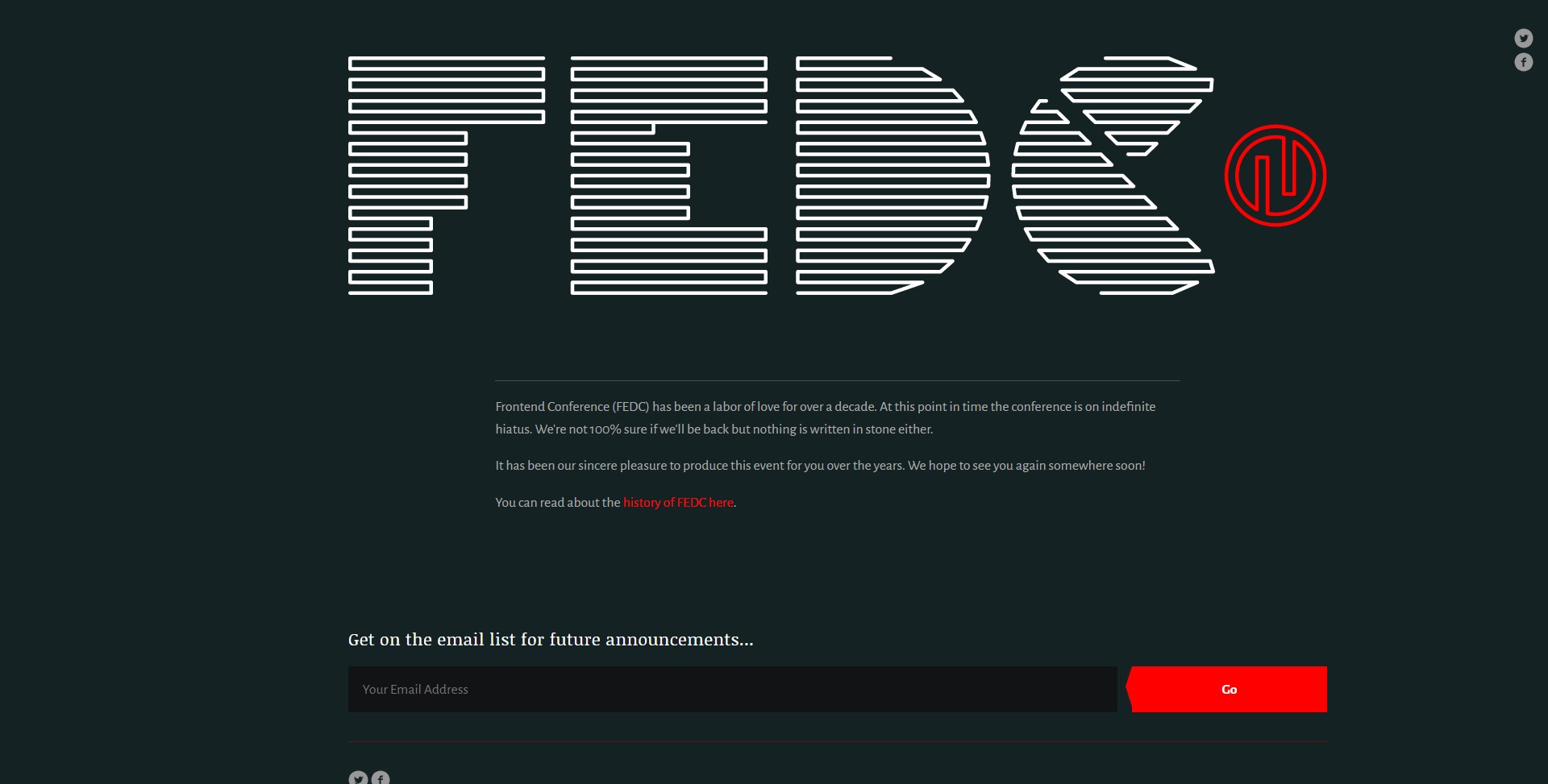
Front-End Design Conference
Grip Limited
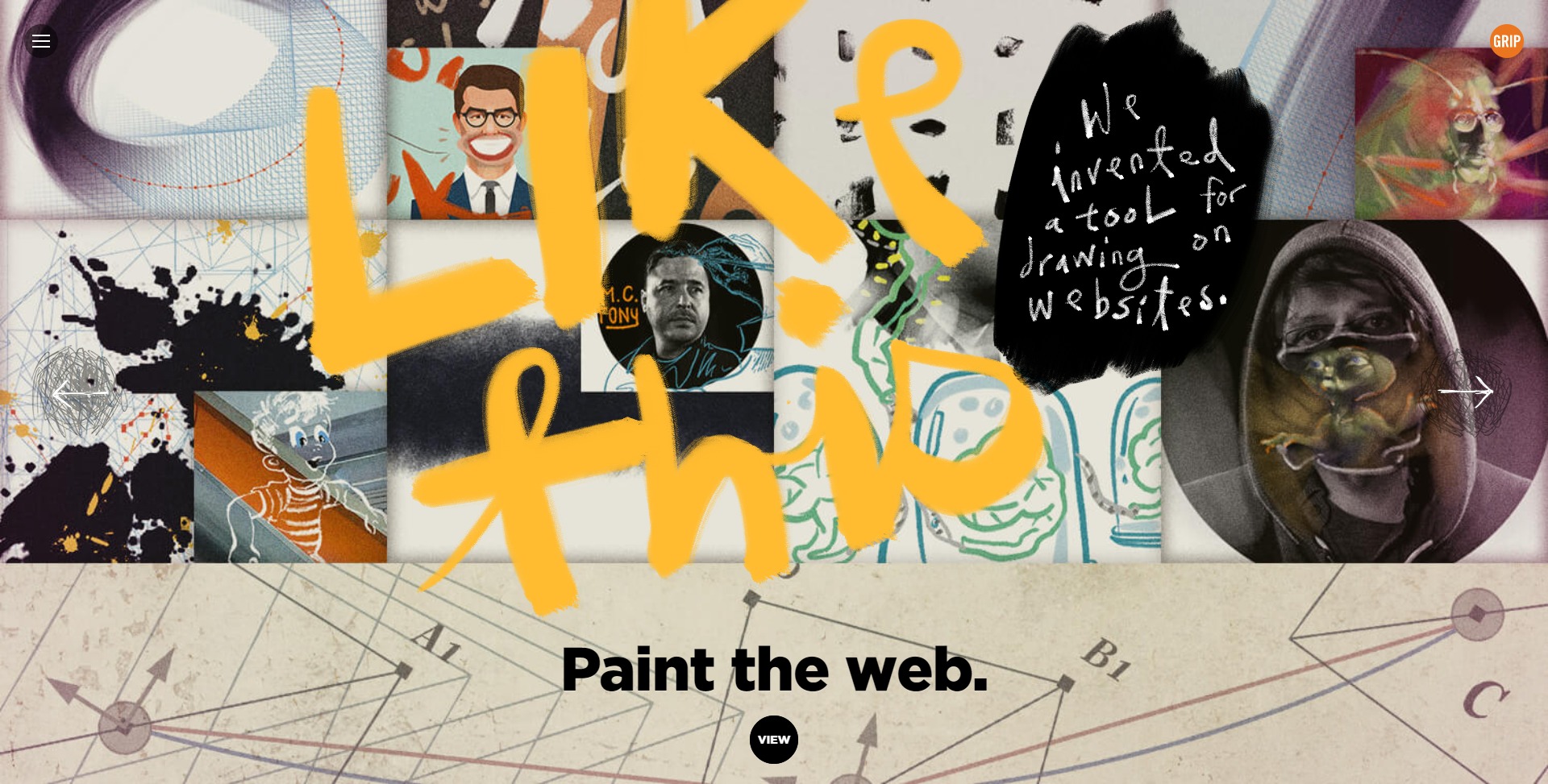
Có rất nhiều màu cam trên “trang đầu” và ít hơn trên các “trang” khác. Tuy nhiên, thiết kế của trang web này rất độc đáo đến nỗi nó có thể trông tuyệt vời ngay cả khi không có bất kỳ màu thứ ba.
204 Beach
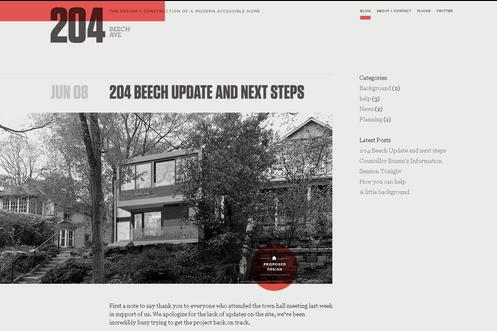
Một trang web rất đơn giản nhưng thanh lịch nơi màu đỏ có thể được giải thích là màu chiến đấu đánh giá theo nội dung.
Thais Vilanova
Đây không phải là trang chủ của trang web. Đó là một trang chỉ minh họa tốt hơn cho việc xử lý màu sắc. Các liên kết và một số yếu tố khác có màu đỏ đồng nhất. Nhưng các chữ cái rải rác dọc theo cạnh phải của trang có nhiều màu đỏ và cam. Mặc dù vậy, tất cả đều trông có màu đỏ.
United Pixelworkers
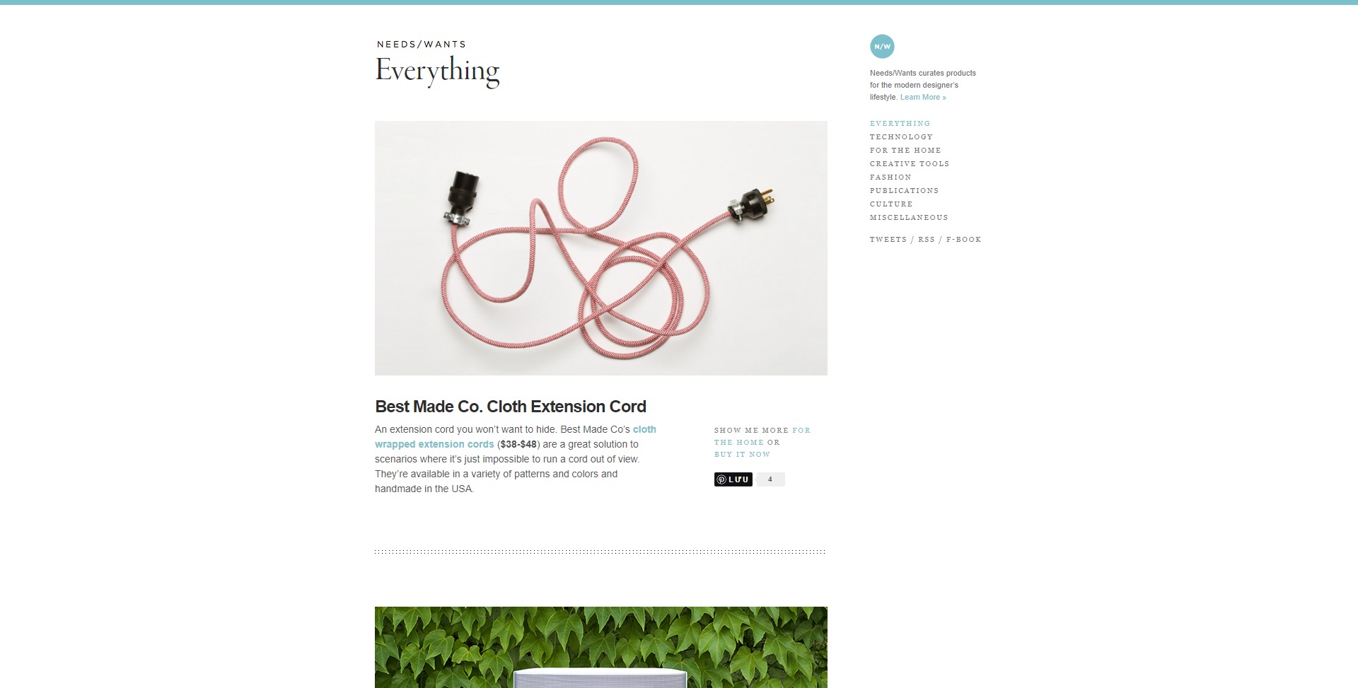
Trang web sử dụng màu xám, một sản phẩm của màu đen và trắng, làm nền và màu pastel của màu đỏ cho các liên kết, giá cả và các mục menu.
Needs/Wants Magazine
Thiết kế lộng lẫy sạch sẽ với chủ đề màu xanh nhạt.
FullyIllustrated
Trang danh mục đầu tư này là ít màu sắc nhất trong số tất cả do không có hình minh họa lớn. Nó thể hiện độc đáo cách phối màu của trang web – rất nhiều màu đen, một chút màu trắng và một chút màu xanh. Tất nhiên, các hình thu nhỏ hiển thị đầy đủ màu sắc trên di chuột.
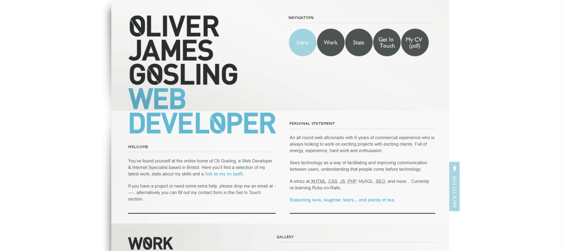
Oliver Golsing
Blitz
Narrow Design
Soft Facade
Astheria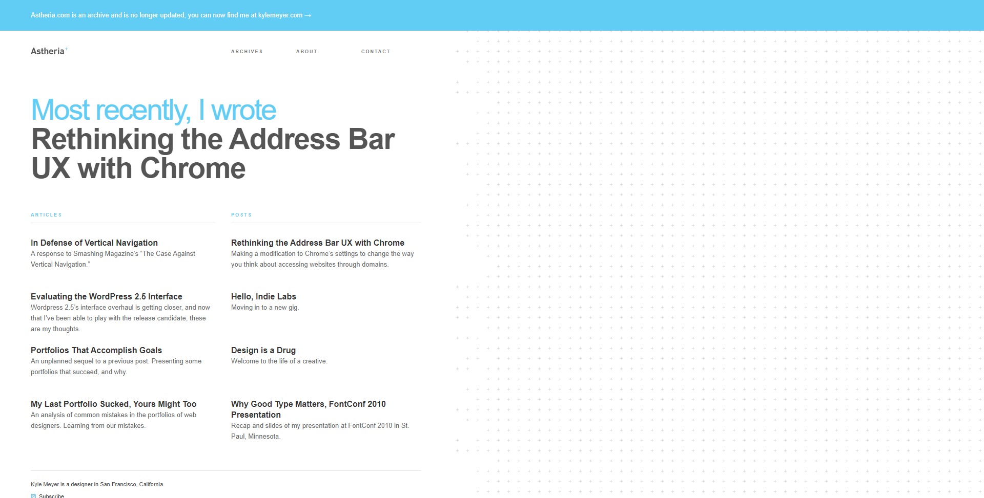
Logitech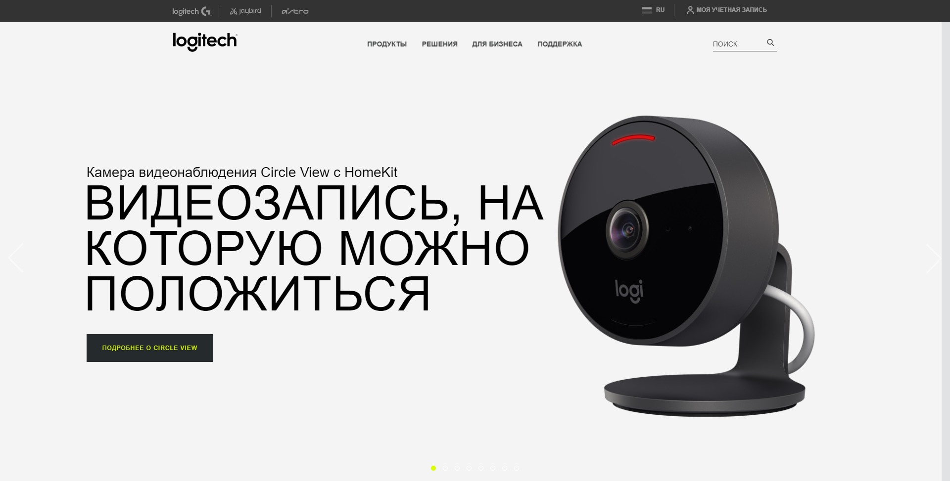
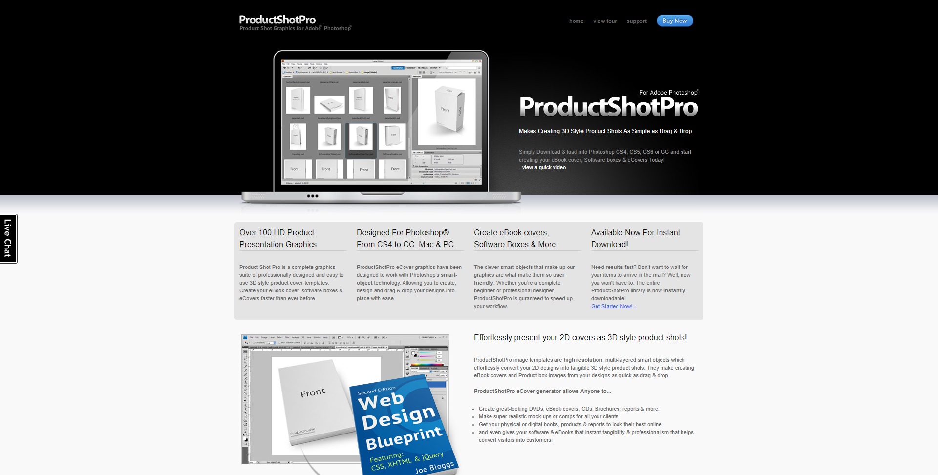
ProductShotPro
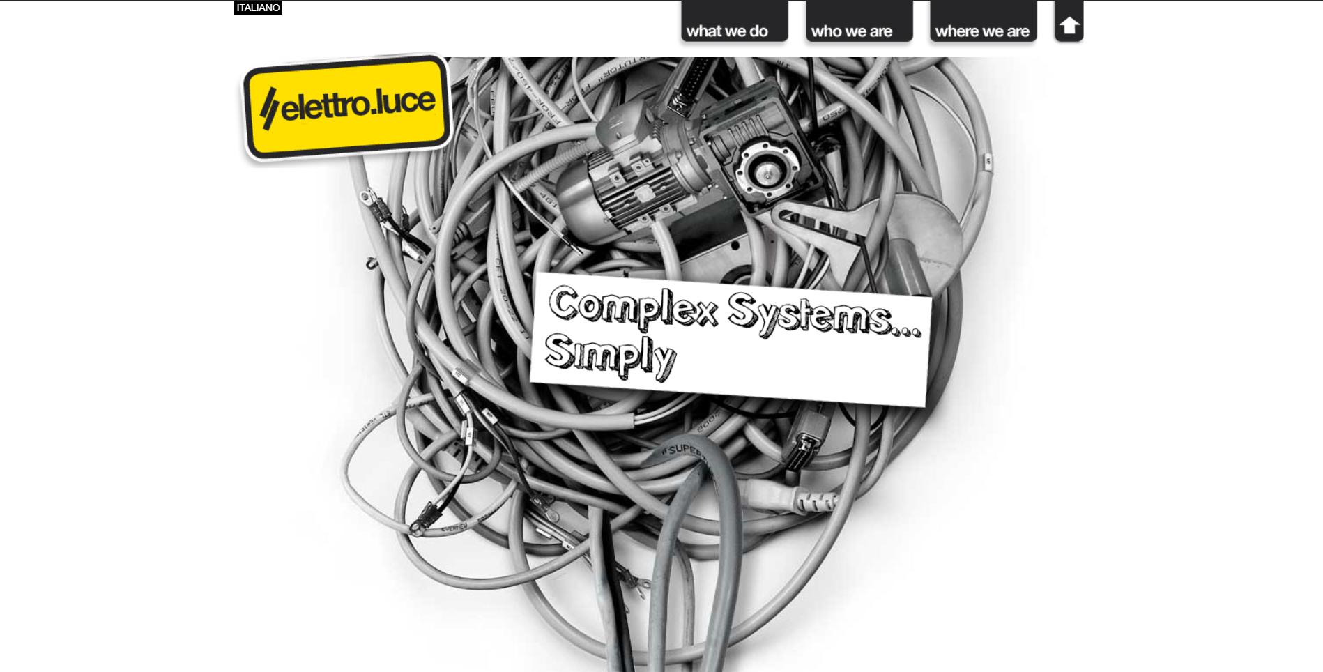
Màu sắc khan hiếm ở đây. Các trang web hầu như chỉ có màu đen và trắng. Tuy nhiên, một vài yếu tố nhỏ màu xanh lam cùng với màu xanh lam trên hình ảnh làm giảm sự đơn sắc này.
Elettro-Luce
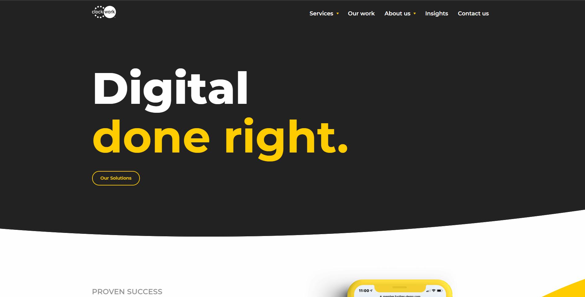
Các mục menu trở thành màu vàng khi di chuột. Màu vàng cũng có mặt trong các phần khác của trang web như là một yếu tố thiết kế trang trí.
Clockwork
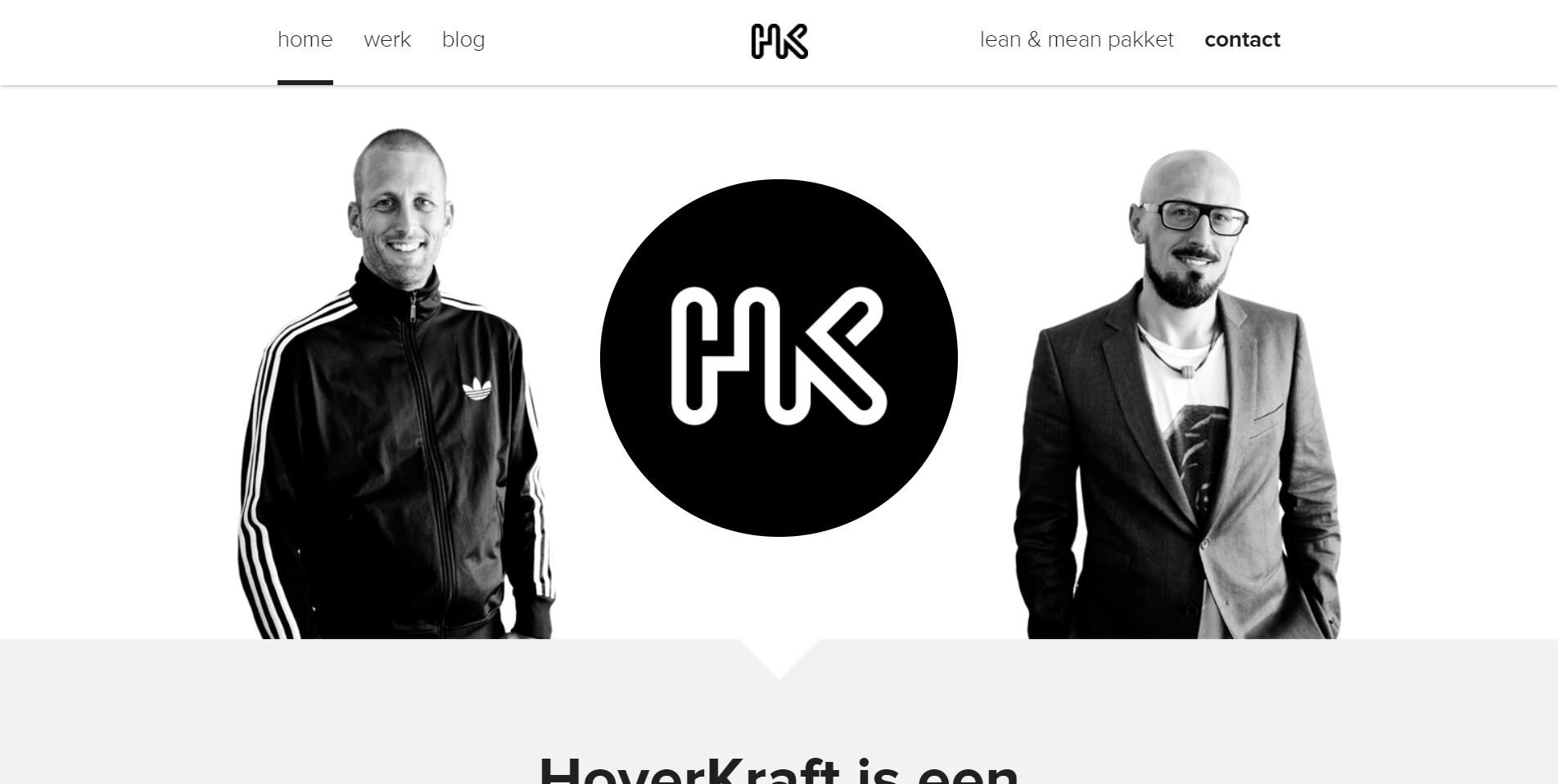
Hovercraft
Typesites
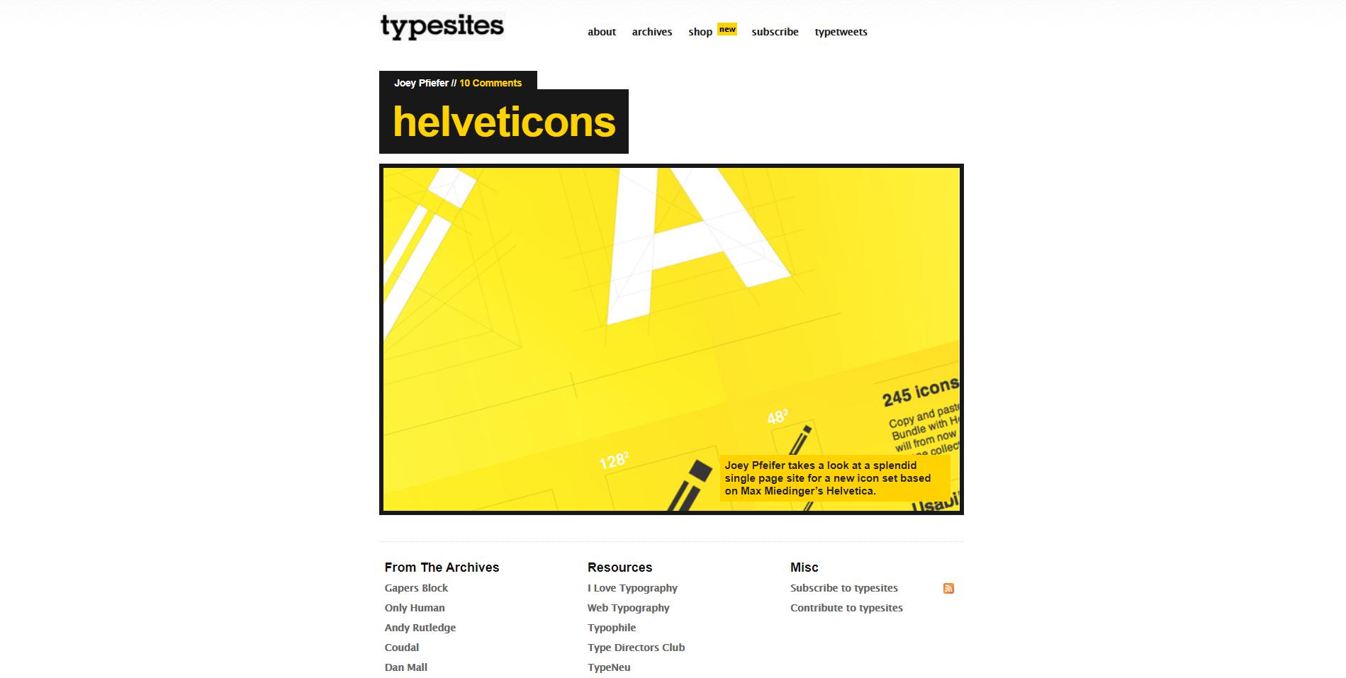
Các mục menu được tô sáng với màu vàng trên di chuột.
We Are Builders
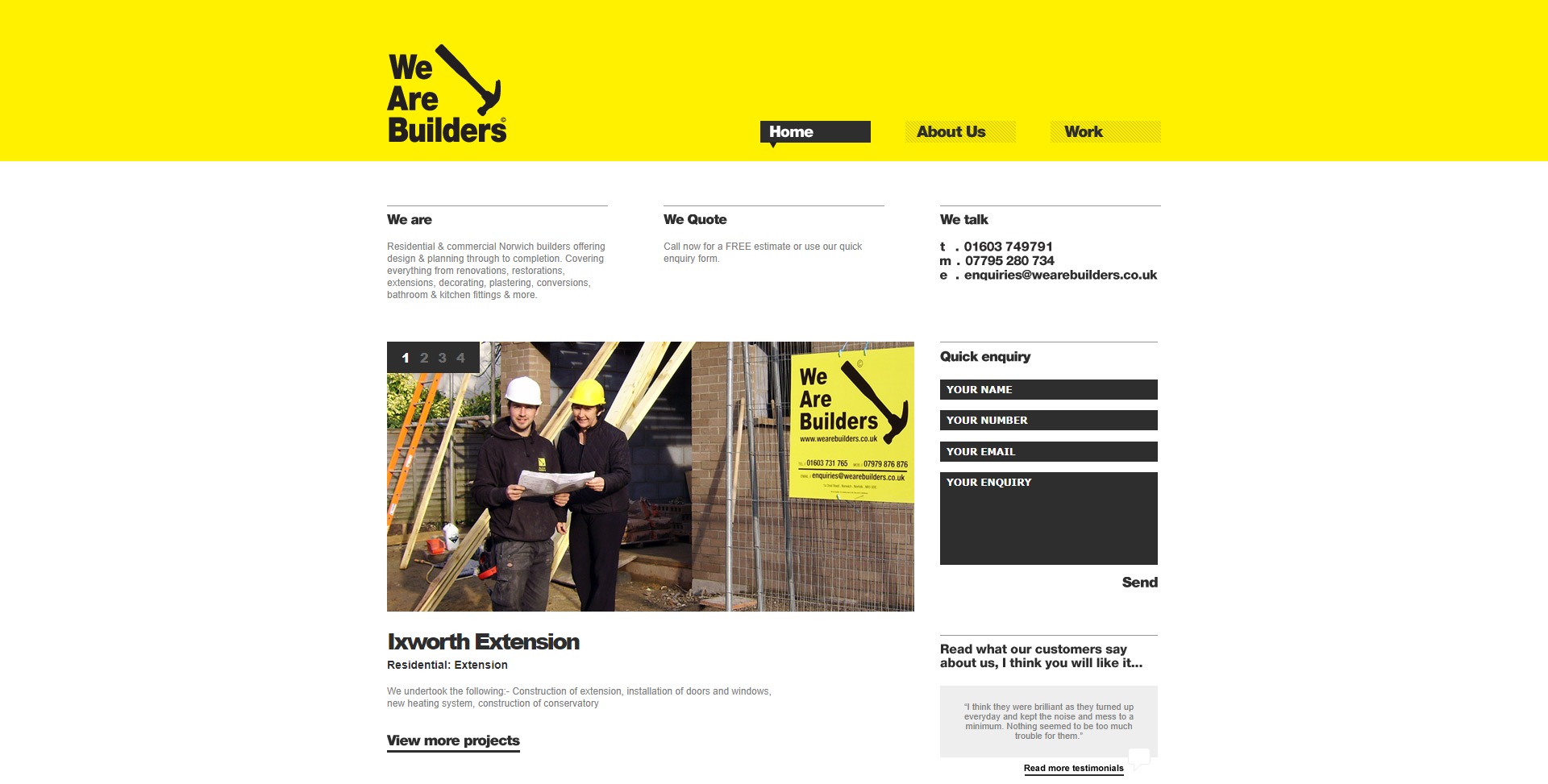
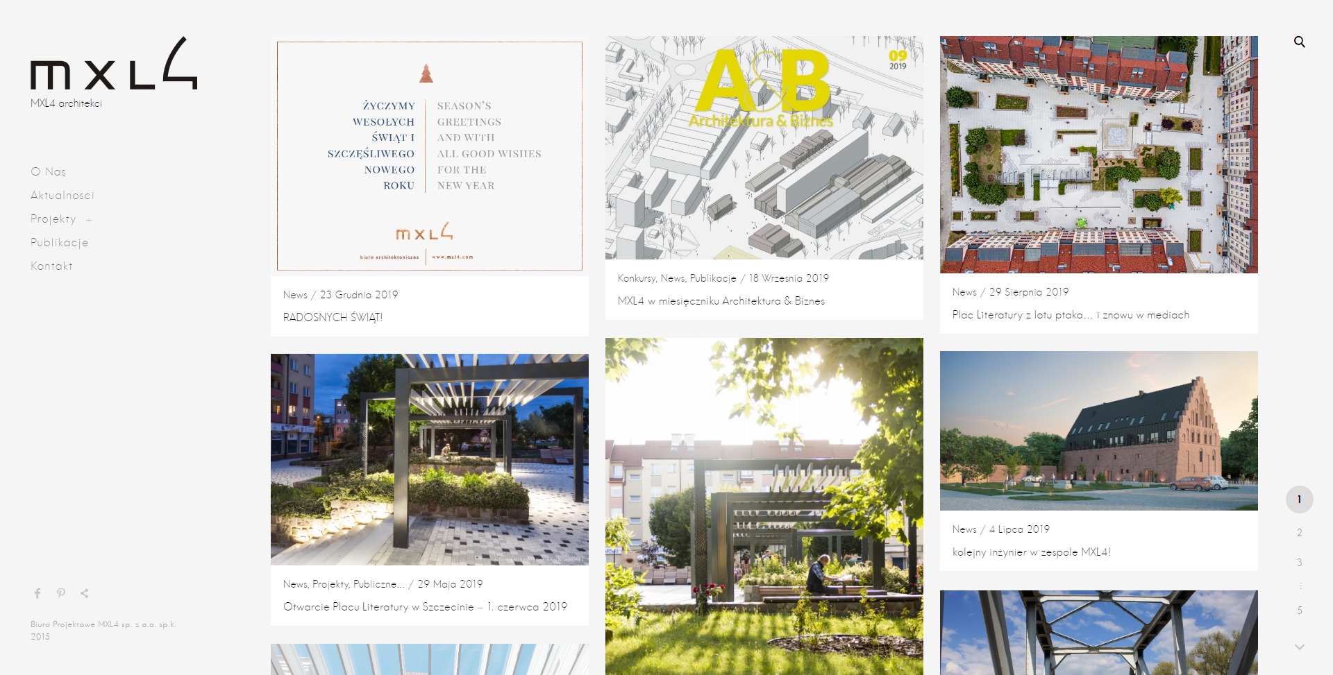
Có một tiêu đề lớn màu vàng gây ra đó là màu công ty. Phần còn lại của thiết kế là màu đen và trắng.
MXL4
Bên cạnh các mục menu được chọn rõ ràng màu xanh lá cây, danh mục đầu tư này hiển thị hiệu ứng di chuột rất đẹp trên các trang tin tức và nhóm.
AisleOne
Soh Tanaka
Danh mục đầu tư này sử dụng nhiều màu xám đen thay vì màu đen thuần túy. Màu xanh lá cây đồng thời thêm một bầu không khí quân sự và một hơi thở của cuộc sống.
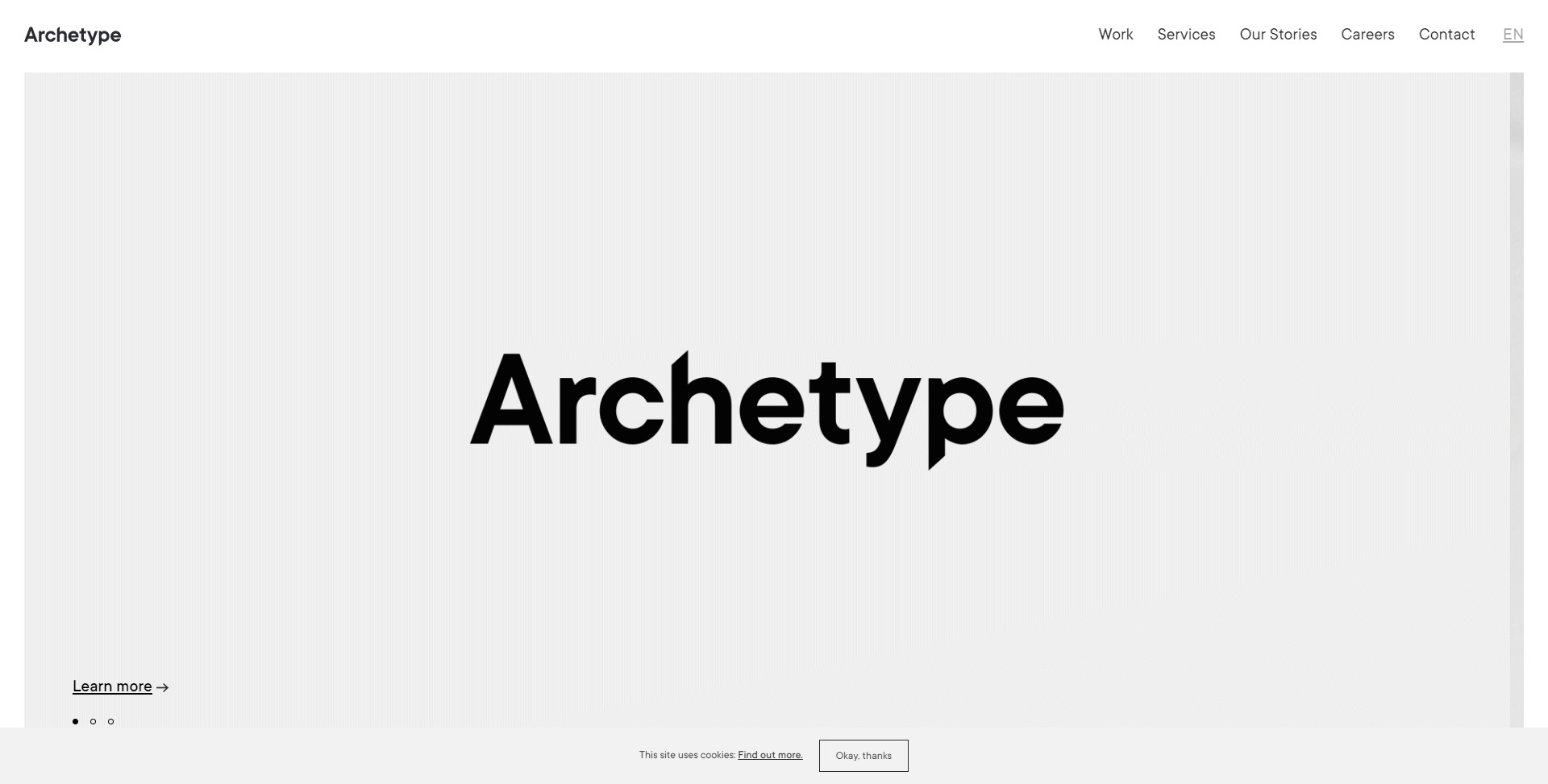
Archetype
Amilo Car
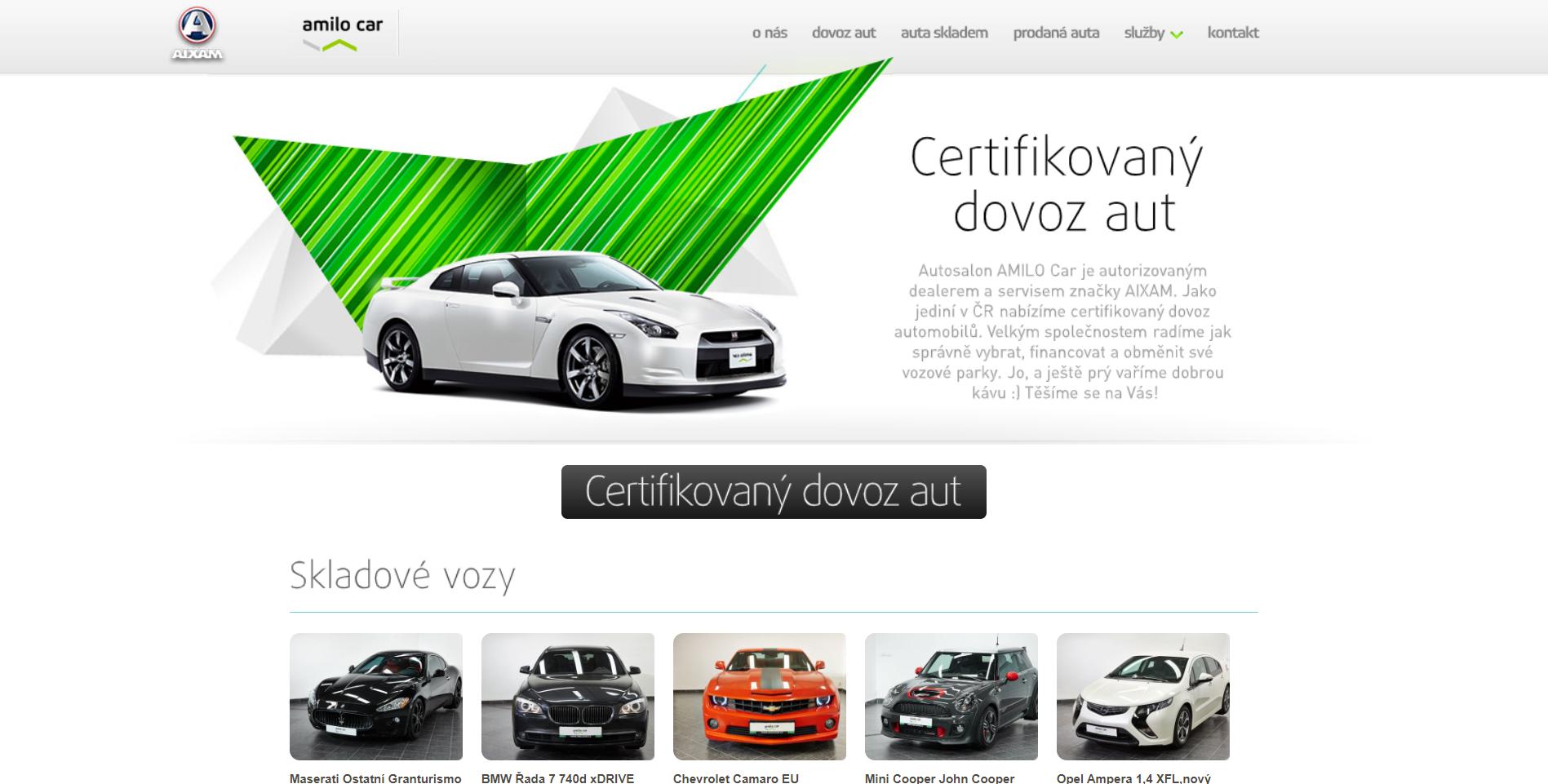
Một loạt các màu sắc được sử dụng trên mỗi trang, từ màu xanh lá cây tươi sáng đến màu ngọc lam, nhưng tất cả chúng đều phù hợp độc đáo với bảng màu trông xanh lục trong một thiết kế sạch đen trắng.
Verticis

Dan
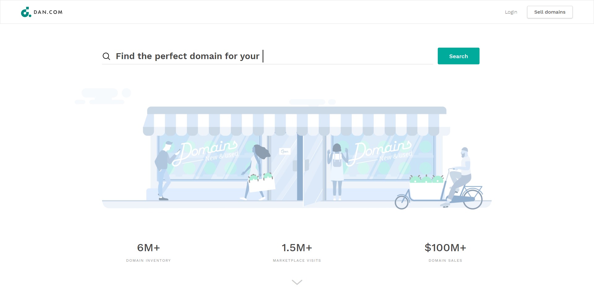
Các khung, đường kẻ màu xanh lá cây và màu vàng rất sáng trái ngược hoàn toàn với nền màu xám của danh mục đèn flash bắt mắt này.
DigitalMash
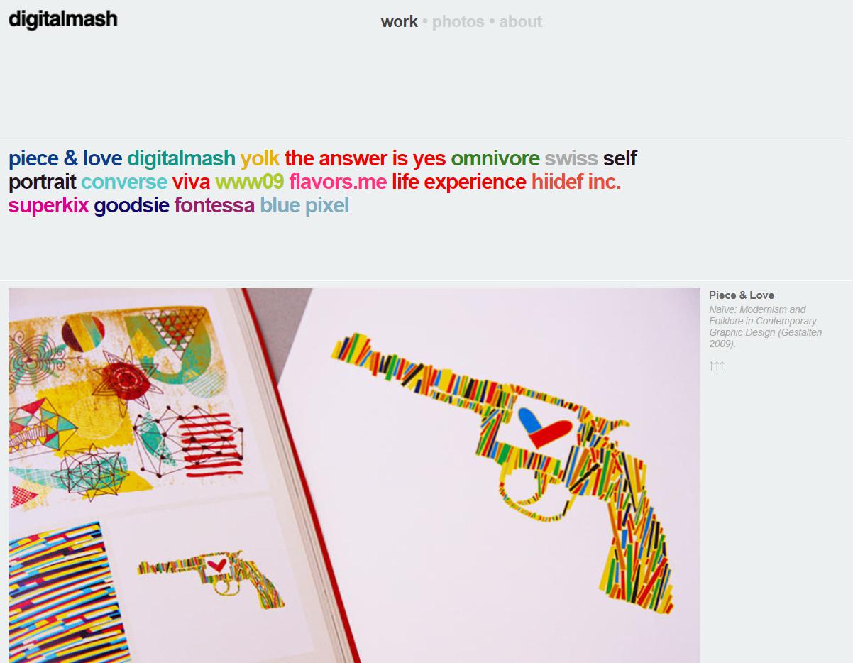
Mỗi trang menu có một vòng tròn màu khác nhau. Ngoài ra, mỗi mục tạp chí cũng có màu riêng biệt (chẳng hạn như màu này hiện trên trang chủ), tạo ra tới bốn mươi màu khác nhau trên trang web này, một màu trên mỗi trang.
Rich Brown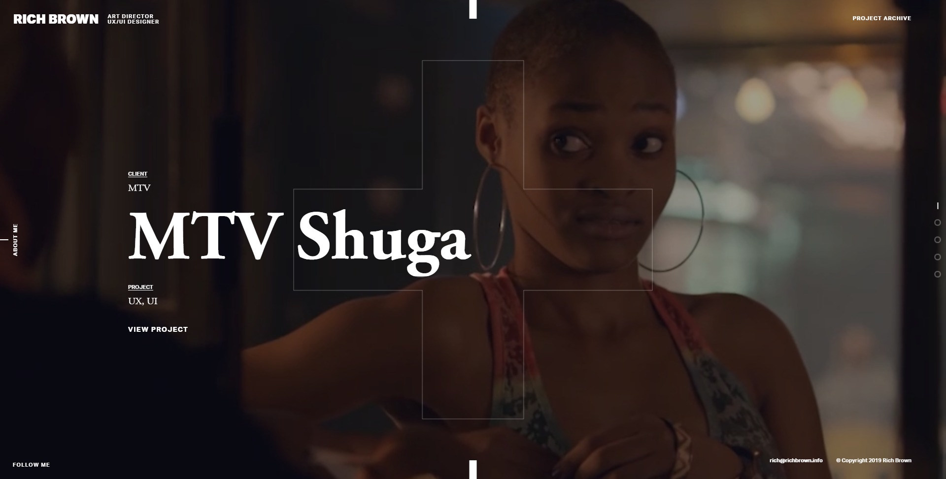
Và cuối cùng, đây không phải là một trang web đen trắng. Không có màu đen. Nó có màu nâu đỏ (màu của một số bức ảnh cổ) nơi có màu sắc khác nhau của màu nâu thay thế cho màu xám. Lựa chọn màu sắc không chỉ nhấn mạnh tên của nhà thiết kế, mà còn thêm sự ấm áp và cá tính vào danh mục đầu tư của anh ấy.

