Một bộ sưu tập các thiết kế menu sáng tạo nhưng đáng tin cậy!
Điều hướng rất quan trọng vì nó hướng dẫn người dùng thông qua trang web và bạn muốn hướng dẫn rõ ràng. Tuy nhiên, một chút sáng tạo và tình yêu sẽ không gây hại gì mà chỉ để lại những cảm xúc dễ chịu từ hành trình của bạn trên trang web.
15 ví dụ về thiết kế menu ban đầu nhưng đáng tin cậy được tạo để dễ dàng hướng dẫn bạn qua trang web.
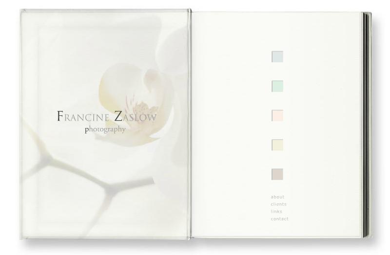
Francine Zaslow
Danh mục flash trực tuyến của một nhiếp ảnh gia Boston Francine Zaslow được thiết kế như một cuốn sách. Nó điều hướng với các nút vuông nhiều màu, và trong khi tải các trang đang lật với quạt. Đây là một trong những lần mà nó không nhàm chán để chờ trong khi trang đang tải.
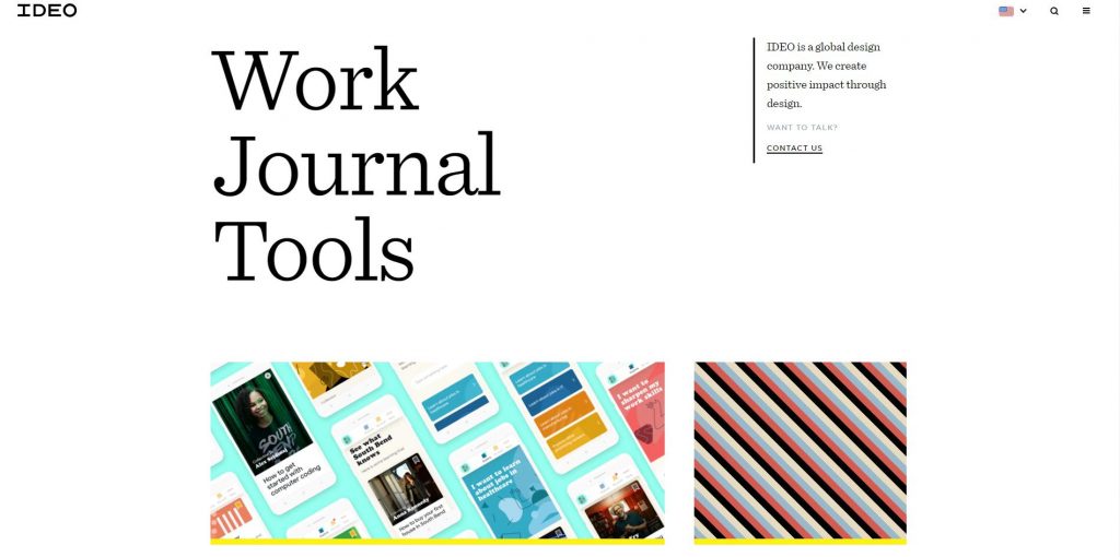
IDEO
Là một colsuntancy thiết kế toàn cầu. Trang chủ của họ bao gồm các ảnh chụp màn hình nhỏ về thiết kế của họ hoạt động với hai mối đe dọa – một cái nằm rải rác trên màn hình và cái còn lại là một cái thông thường ở phía dưới. Khi bạn trỏ con trỏ vào danh mục, số lượng ảnh chụp màn hình sẽ được đánh dấu. Mỗi trang con có thiết kế độc đáo với điều hướng khác nhau, có vẻ hơi mất tập trung nhưng khá thú vị.
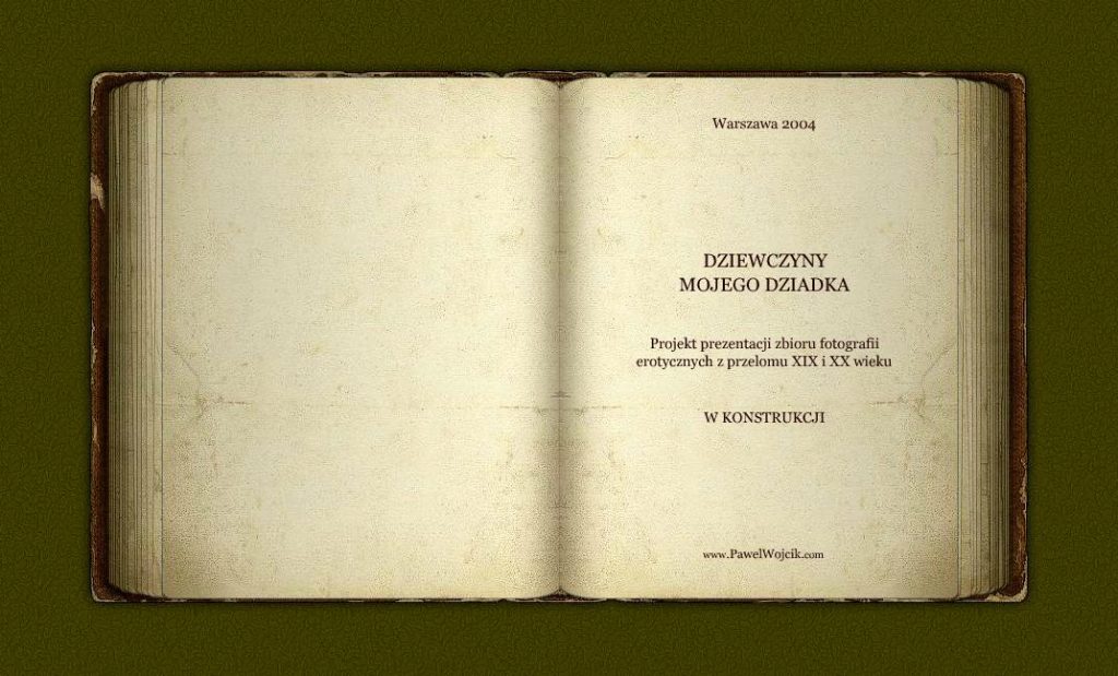
Pawel Wojcik
Buổi giới thiệu trực tuyến về nhiếp ảnh của Pawel Wojcik cũng được thiết kế như một cuốn sách và trong nháy mắt. Tuy nhiên, không có menu nào – để điều hướng nó, bạn chỉ cần trỏ con trỏ vào góc của trang sách và nhấp, và trang lật lại. Nó có thể không phải là nguyên bản mà là phong cách khiêu dâm cổ điển trong các tác phẩm của Pawel kết hợp với phong cách cổ điển của cuốn sách tạo cảm giác hài hòa như thể bạn đang xem qua một bức ảnh cũ.
Nhà hàng Prinz Myshkin
Và thêm một trang web flash kiểu sách – đại diện của nhà hàng Prinz Myshkin trực tuyến. Lý do tôi thích thực đơn của họ là nó rất không phô trương và exqusite, nhưng dễ điều hướng.
Vấn đề đỏ
là thương hiệu quần áo của phụ nữ. Giống như thương hiệu tự tôn vinh cá tính và tự do của phụ nữ, trang web của họ cũng vậy, vì bạn phải ‘tự vẽ ra những gì bạn muốn làm. Bạn vẽ các mũi tên, và sau đó theo dõi đến một trang khác của trang web. Và mũi tên không phải có kích thước hoặc góc cụ thể – bạn có thể tự mình chọn chúng – họ chỉ cần hướng lên, xuống, sang trái hoặc phải. Tôi thấy nó khá nguyên bản!
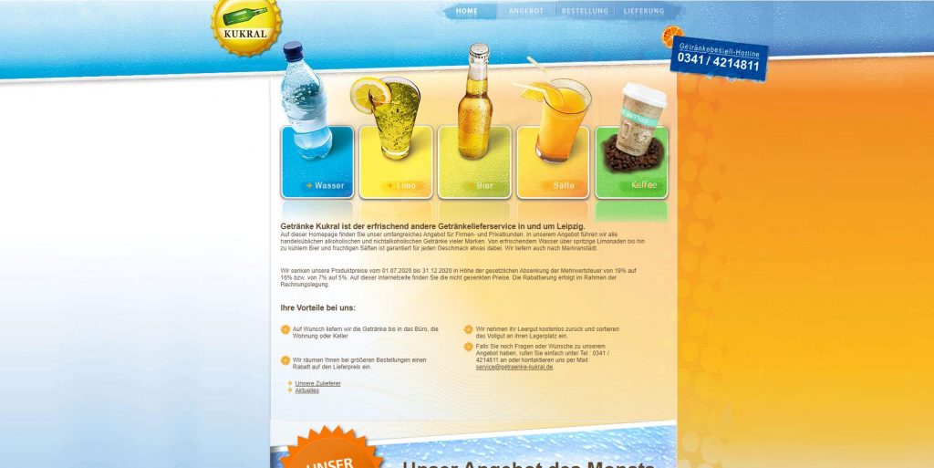
Getränke Kukral
Là dịch vụ cung cấp đồ uống ở Leipzig và môi trường xung quanh. Thiết kế trang web rất đơn giản, nhưng tôi thích cách họ sử dụng các biểu tượng đồ uống trên các nút.
Simple Art
Là một studio thiết kế web có trụ sở tại Nga. Tôi rất thích thực đơn kiểu bàn của họ với một số thứ nhất định trên đó là các liên kết đến các trang con.
Boukarabila
Là danh mục đầu tư trực tuyến của một nhà thiết kế đồ họa Kerim Boukarabila. Tôi thấy menu ngang khá hấp dẫn mặc dù sáng bóng. Và các bình luận xuất hiện trơn tru cho mỗi thể loại là một bổ sung tốt đẹp vào menu.
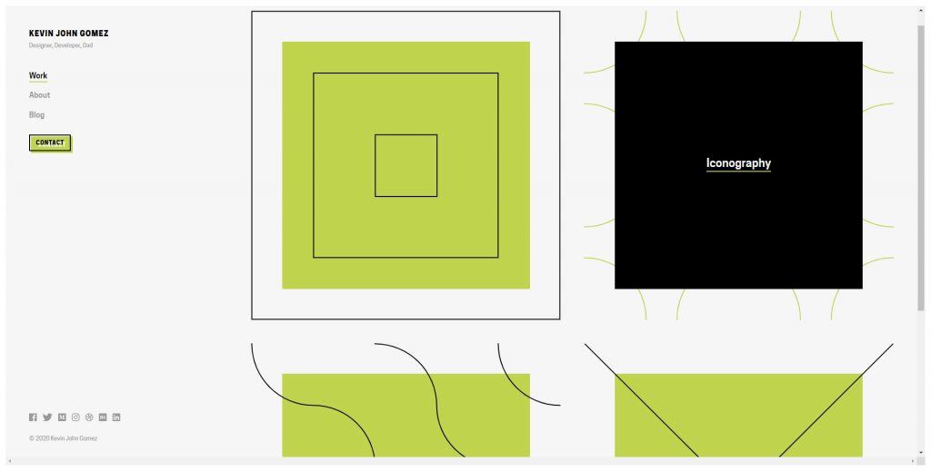
Kevin John Gomez
Trang web của một nhà thiết kế web Kevin John Gomez có trụ sở tại Rochester khá vui nhộn do các yếu tố viết tay và giấy, minh họa mực và chân dung ngớ ngẩn. Và mặc dù Noob-ish, nó vẫn nguyên bản trong thiết kế của nó – ít nhất, bạn không được điều hướng từ đầu trang của Big Noob.
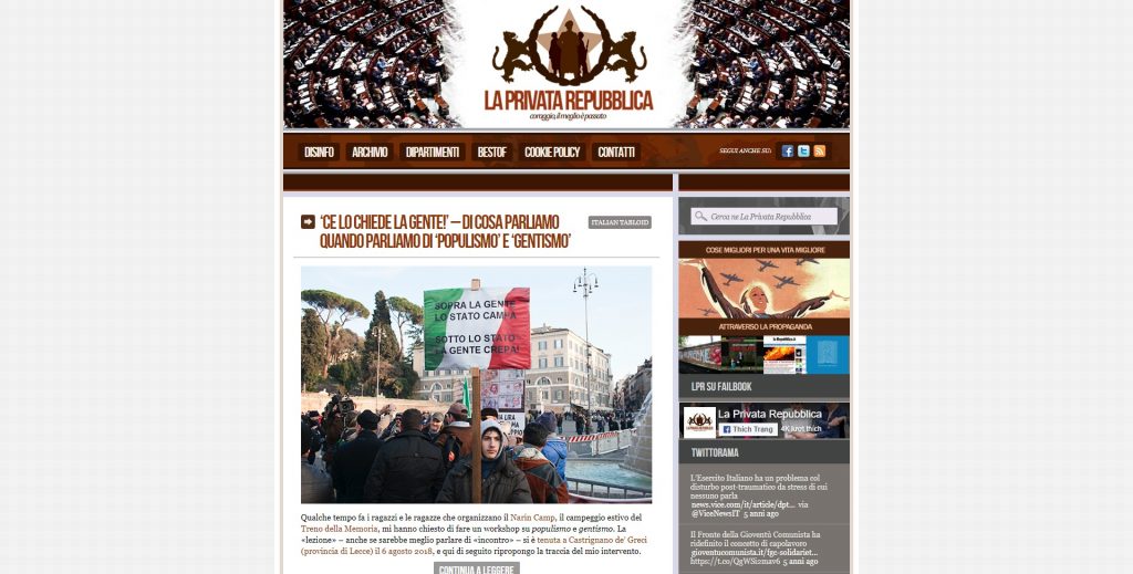
La Privata Republica
Mặc dù được thiết kế theo phong cách trang trọng, nhưng menu trang web của La Privata Republica khá thân thiện và không chính thức do hình dáng con người trong những tư thế thoải mái trên đó. Thật đáng ngạc nhiên khi đôi khi rất cần thiết để tạo ấn tượng không giới hạn về một trang web bị hạn chế!
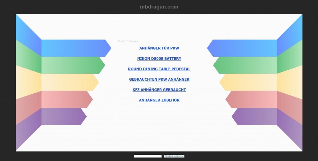
MB Dragan
Là một cơ quan tương tác phụ thuộc có trụ sở tại Bucharest Romania có thiết kế trang web màu xanh gọn gàng với menu chủ đề không gian – một ví dụ thực sự về ứng dụng sáng tạo và khả năng tiếp cận tuyệt vời.
Timefordding
Phương tiện truyền thông sáng tạo, inc. là một công ty thiết kế đồ họa và web ở vùng núi Frisco, Colorado. Tôi bị thu hút bởi thiết kế trang web của họ vì nó theo phong cách retro và đặc biệt là tiêu đề được ghép bằng giấy với một menu viết tay. Không chính thức và phong cách – chỉ như thế này!
Sarah Hyland
(từ nhóm nhạc Punk Punk của MTV) là một diễn viên hài, diễn viên, nghệ sĩ cải tiến, nghệ sĩ đường phố và nữ hoàng trượt băng nghệ thuật. Trang web của cô là một phản xạ thực sự của tính cách của cô – tươi sáng và khiêu khích. Các menu giống như phác thảo phù hợp với nó vừa phải!
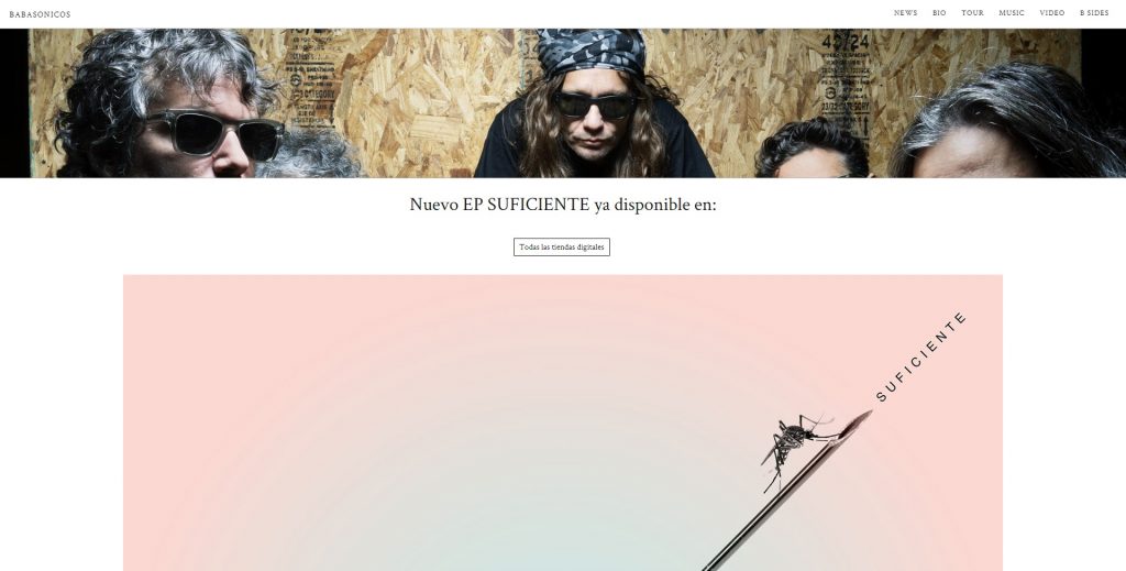
Babasónicos
Là một ban nhạc rock của Argentina đã nổi lên trong làn sóng các ban nhạc New Rock của Argentina vào cuối thập niên 80 và đầu thập niên 90. Menu được thiết kế giống như một poster sử dụng kiểu phong cách vũ trường táo bạo phản ánh đúng tinh thần của họ.
Bạn không cần phải hiểu tiếng Tây Ban Nha để đánh giá cao thực đơn viết bằng bút chì mà trang web Oink có. Nó trẻ con và cẩu thả, nhưng vẫn dễ thương, cái gọi là ‘bất cẩn’.

